
Why "Good Enough" AI Logos are Killing Your Brand
In 2026, the temptation to "prompt" your way into a new brand identity is at an all-time high. It’s fast, it’s cheap, and, at first glance, it looks pretty slick. But as the market becomes saturated with AI-generated visuals, a new problem has emerged: The Uncanny Valley of Branding.
When a logo is generated by an algorithm rather than a strategist, it lacks the "soul" and technical precision required to build long-term trust. Here is how to spot the digital fingerprints of an AI logo and why they might be a liability for your business.
The "Melting" Geometry
AI models work on probability, not geometry. When you zoom in on an AI-generated icon, you’ll often find "liquid" artifacts.
The Glitch: Lines that should be parallel slightly converge; circles aren't perfectly 360 degrees; or two shapes "melt" into each other in a way that would be impossible to replicate in physical media like signage or embroidery.
The Professional Fix: A human designer uses vector points and mathematical paths to ensure every curve is intentional and clean.
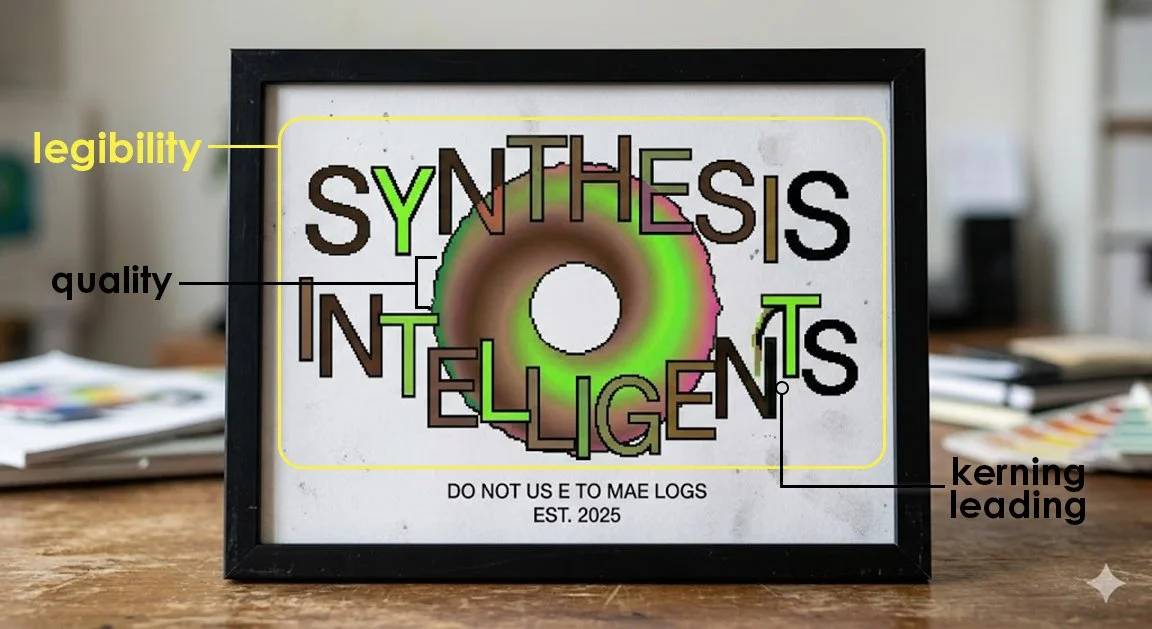
The Typography Crisis
AI has gotten better at spelling, but it still fails at Kerning (the space between individual letters) and Leading (the space between lines).
The Glitch: You’ll see a "W" that is practically touching the "E," while the "L" next to it is floating in space. The fonts often look like "Franken-types" a weird hybrid of a serif and a sans-serif that doesn't actually exist in any professional font foundry.
The Professional Fix: Typeface selection is about mood and readability. A designer ensures your brand name is legible from a block away or on a tiny Instagram notification.
The "Prompt-y" Aesthetic
AI tends to default to "the most likely" version of an idea. This results in incredibly generic metaphors: the "shiny gear" for tech, the "leaf" for wellness, or the "lightbulb" for consulting.
The Glitch: These logos often feature unnecessary 3D gradients, glowing edges, and "lens flares" that try to mask a lack of an original concept.
The Professional Fix: Design is about subtraction. A professional logo is stripped down to its most potent essence so it can remain timeless, not just "trendy" for the next six months.
The Verdict: AI is a great mood-board tool, but it’s a terrible architect. If your logo is the foundation of your business, you don't want it built on a "hallucination."